Book Cover Design: Don’t Say Never
The thing about designing a book cover is that no matter how much artistry is involved, the point of a cover is to sell the book. It’s to convince a potential reader to pick it up at the bookstore, and, more relevantly these days — to see the teeny tiny thumbnail in a sea of other thumbnails while browsing an online retailer on a small screen, and go hmm, I want to click that.
So the job of the designer is two-fold: having the skills and techniques and creativity to create a beautiful, eye-catching cover is obviously a must, but on top of that, understanding that a cover needs to fit into the book genre, into the proper niche[s] the book is slotted into is absolutely necessary. The market research is as important as finding the perfect image for the front cover.
Enter author Jen Teegarden, who upon finishing writing her debut novel, Don’t Say Never, a contemporary adult romantic suspense, contacted me about designing the cover. This is where serendipity meets opportunity, because from the get go, even before I did any market research, I knew this book would fit into the trend of big bold text that somehow interacts with the background imagery, that was going on in contemporary adult books of late. And that I had been dying to play around with.
My market research [i.e. going to Amazon and looking at the top seller book covers on the specific categories this book fit into] just confirmed it:

Looking at all of these covers together, we can clearly see the specific elements that unite them — even beyond the big sans-serif titles interacting with the background that I first thought of, there’s also the abundant use of nature imagery, be it the sky or water or greenery. Wide angles, big spaces. Light through trees. Red or yellow details. Only a few of these covers have people in it, and no faces at all.
Jen had already decided she didn’t want people on the cover even before my research, so that was settled. A big section of the book happens at a remote cabin in the woods, and Jen also talked to me about an image she had in her head of moonlight and a starry sky. All of these specific elements she gave me, plus knowing ahead of the design that I had to make the cover fit into this particular niche, I got to work and came up with two initial ideas for the full wrap paperback design:
OPTION 1
OPTION 2

Jen went with option 1, even though she really liked the tall skinny trees on the second option [we’ll get back to that in a bit], the cabin in #1 was what made it. The other notes she gave me were to switch the typography to white, and make the grass less green, add some patchiness to it. Also to deepen the color of the cabin further.
Here’s the second draft:

The front cover was getting closer to the final artwork. Jen asked if I could remove the two small pine trees in the foreground, and as I had added them as isolated items in the first place, that was easy to do. And then we came back to the tall skinny trees: what if we used the back cover of the second option I had initially created, using the big tree trunk to fill up the spine?
So I blended the big tree trunk and its neighboring ground into the left bottom corner of the front cover for the third draft:

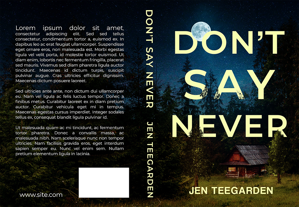
Removing the two small pine trees revealed the small shrub that I was trying to hide in the first place, but it turned out that both Jen and I loved it there. Yay. \o/ Front cover and spine locked, then it was just a matter of completing the final step: adding all the back matter elements to the back cover, and adjusting the imagery to compliment it.
Here’s the final paperback artwork:

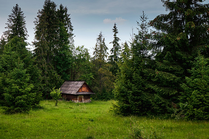
Just as a curiosity, here’s the original cabin stock image I used on this design. It really started out in daylight and without windows:
Jen was extremely gracious to write up a review of my work on her cover:
*tears up again*
Anyway. Pick up a copy of Don’t Say Never, by Jen Teegarden, on Amazon.
 I’m Tissa. I wanted a blog so I made myself one. The tiny-flowers part comes from