Hi I’m lazy
So I’ve had this domain since 2005, and for a bunch of years back then — it was before Tumblr and Twitter, while I spent all my time on Livejournal — it was where I hosted a whole bunch of manually coded html sites for all sorts of fandom-y things. But it was never a site proper. I didn’t need a blog back then because I had LJ, and I had another fandom-y site that took up my free time.
The old tiny-flowers.net did, however, have a splash page, and one single second page where I used to list all the stuff that was hosted here. With time, the sites that used to be hosted here all went away, and so did that second page, but I had kept the front page up all these years.
Anyway. This used to be tiny-flowers.net’s front page:
 [I kept it online too because I’m sentimental]
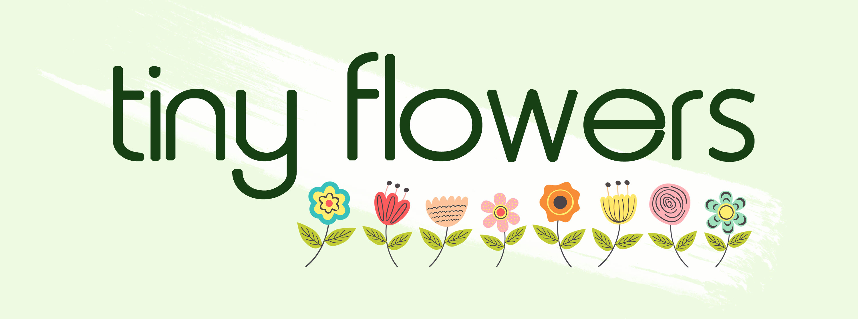
And when I decided to revamp this site and make it my new blog, I needed a new logo, and I could not figure out what to do. I’m perfectly aware that it’s a silly domain name. I mean, Tiny Flowers sounds like a minor character on a My Little Pony cartoon. And I tried making something more slick, more grown up… and I hated everything I came up with. I just kept going back to that old splash page. All these years later, and I felt like it had just the right amount of silly to go with the silly domain name.
So one day I figured why the fuck not — what if I remade the old logo? I knew which font I had used back then because it’s still one of my favorites [Metro], and I knew I had some flower illustrations hanging around in my clipart collection. I had drawn the flowers myself in the old logo, but I’m no illustrator, and they only look okay in a teeny tiny made-for-a-800×600 low-res monitor from 2003. So I went with the super cute flowers from this collection I had purchased a few months ago.
I had initially made the brush stroke using the same green from the background of the old splash page:
But as I started building this site, the all white pages were putting me off. I just knew I had to go all over with the pale minty green from 2005. It’s all the rage back again now, just like blogs have become the new thing to have again. Newsletters are back too, you know. All of this has happened before, Cylons are from 2005 too, I guess.
So I made the brush stroke white against the pale green. Just like it was originally. And that’s how the old logo became the new logo.

…But mostly because I’m lazy.
 I’m Tissa. I wanted a blog so I made myself one. The tiny-flowers part comes from